
I am not a specialist in the subject of “Art”, I am an Environmental Engineer, but this does not mean I do not possess some appreciation criteria of my surroundings; once the reader gets to take into account my origins, I shall share my perspective. Before proceeding in the topic I would like to share that the Oxford Dictionary defines “Art” as:
“The expression or application of human creative skill and imagination, typically in a visual form such as painting or sculpture, producing works to be appreciated primarily for their beauty or emotional power.”
When I try to classify myself, like usually people form the area of exact sciences do; I work directly with quantifiable information using & creating visual interpretations with the support of software tools. I create a sketch in my mind or on paper, which communicates my desire to express in a digital way, though, this visual information is not created instantly; you require to process the information from its quantity, distribution, shape & colour. It becomes art by seeking that ideal point of equilibrium that is a manifestation of the creativity of the individual who treats the data.
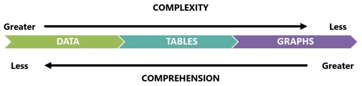
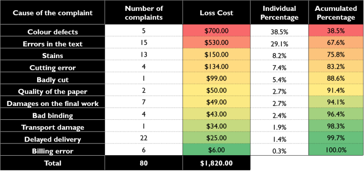
The data can be represented in the form of tables & graphs. The tables may appear with countless rows sorted in an ascending or descending order; admiring & polishing its contents, from ideas & numbers in different units that can be accompanied by colours that allow you to admire them, by their importance; they cause an effect of peace or concern according to the person who interprets them. There are many combinations which grant it a unique characteristic & interpretation, depending on its equilibrium I decide to either ignore it or stay a few seconds, even minutes appreciating it. In case I feel attracted to its presentation & content, I choose to acquire it & share it in my job or academic environments. The same thing happens with graphs.
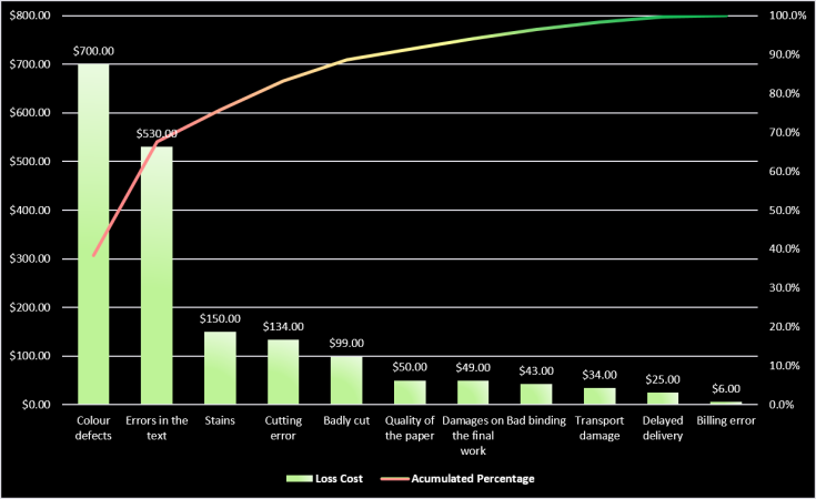
Graphs may appear in different shapes, sizes & colours; they express ideas & different units. From my point of view graphs are much more efficient than tables to communicate ideas in a much more digestible manner. While graphs possess a greater degree of complexity because they order data; graphs are born posterior to the treatment of data, gathered & ordered inside of tables which portray the information in an easier way, that capture the attention of the viewer. Although they look very attractive, colourful & beautiful, the tables possess the advantage of being a detailed scan of the information, which is why I consider them, a degree of art of greater difficulty applied in the matter of data management.
To conclude, just as there are unique pieces of art, I also consider that there may exist unique tables & graphs, which communicate the style of the author & the employed techniques. Just as there are good & bad artists, the same happens with creators of visual elements of applied interpretation. We simply have to stop for a moment & watch closely.
NOTE: The images used in the present writing are authorship of the Philosophical Engineering. Although, the image used in the header of the post is authorship of Bazikg.


Leave a comment